
Tradie Marketplace - Lessons from a Failed Launch
B2C Property Services Platform, Mid-Project Engagement
Role
UX Designer
Timeline
6-12 months
Team
Development team, external design agency (initial work), CEO
Outcome
Platform shut down shortly after launch
Why Share a Failed Project?
Most portfolios only show successes. This case study demonstrates maturity, self-awareness, and the ability to extract valuable learnings from difficult situations. The insights from this project directly informed better decisions in subsequent work and shaped my approach to stakeholder management and user research advocacy.
Constraints & Context
- Joined mid-project with foundational design decisions already made by external agency
- Mobile-first designs provided (5 screens) without desktop strategy or responsive approach
- No product strategy or shared understanding of what to build
- CEO micromanagement with frequent UI change requests (button placement, colors)
- Launch pressure prioritised over user research and validation
- Constrained to work within existing design framework
- Ambiguous requirements with constantly shifting priorities
Problem
A B2C platform aimed to connect property owners with tradies (electricians, plumbers, etc.) to fix property issues. The company engaged an external agency for initial research and produced 5 basic mobile screens as a starting point. However, when I joined the project, there was no coherent product strategy, no plan for scaling the mobile-first designs to desktop, and significant ambiguity about what features should actually be built. The CEO was heavily involved in tactical design decisions while strategic direction remained unclear.
State When I Joined
- External agency had delivered 5 mobile screens based on limited initial research
- Development had begun building from these screens without full design system
- No desktop designs or responsive design strategy existed
- Core user assumptions had not been validated with real users
- Team was struggling to make design decisions without clear direction
My Approach
- Conducted comprehensive UX audit of existing designs against remaining product requirements (Understand)
- Identified critical gaps between mobile-first approach and desktop user needs (Understand)
- Advocated strongly for user research despite resistance from management focused on launch timeline (Define)
- Successfully negotiated to conduct user testing sessions with 12 participants representing target users (Validate)
- Designed test scenarios to validate core assumptions about how users would find and choose tradies (Validate)
- Analysed user feedback to identify patterns and prioritise pain points by severity and impact (Understand)
- Made strategic design decisions to bridge mobile designs to desktop while working within existing constraints (Design)
- Prioritised user insights into "must-fix pre-launch" vs "can address post-launch" based on business timeline pressure (Decide)
- Navigated CEO micromanagement by documenting design rationale and connecting changes to user needs (Collaborate)
- Advocated for addressing critical user insights before launch, though not all recommendations were implemented (Decide)
User Research Insights
Sample Size
12 participants
Methodology
Moderated usability testing sessions with task-based scenarios
Participant Composition
Property owners who had previously hired tradies for home repairs
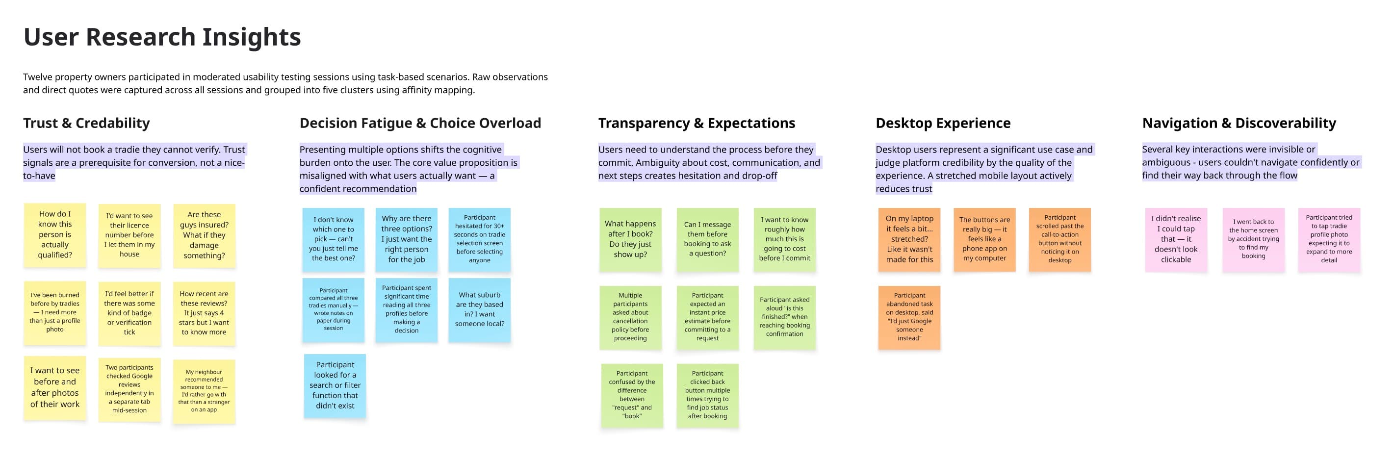
Affinity mapping used to synthesize research findings from 12 user interviews, revealing that users wanted curation over choice
Trust and verification concerns
Users expressed anxiety about tradie credibility, wanting to see qualifications, insurance, reviews, and verification badges before engaging
Impact: Critical barrier to platform adoption - users wouldn't book without trust signals
Decision fatigue from choice overload
Platform presented users with up to 3 tradies to choose from, but users expected the platform to suggest the best tradie for their specific need rather than requiring them to evaluate multiple options
Impact: Core value proposition misalignment - users wanted curation and confidence, not comparison shopping
Desktop experience felt like stretched mobile
Desktop version didn't leverage screen real estate effectively, making the experience feel unpolished and less trustworthy
Impact: Reduced credibility of platform for desktop users who might be booking higher-value jobs
Tough Decisions Under Constraints
User research revealed fundamental assumption problem
Recommended platform provide single "best match" tradie recommendation instead of multiple choices
This would require significant backend matching logic and algorithm development, conflicting with imminent launch timeline
Recommendation was noted but not implemented pre-launch due to timeline constraints
Desktop design gap with no time for full redesign
Created responsive adaptation strategy that maximized existing mobile components while adding desktop-specific enhancements
Desktop experience was functional but not optimal - compromised on ideal UX to meet launch deadline
Shipped a workable desktop experience within constraints, though not as strong as a desktop-first approach would have been
CEO requesting frequent UI changes without user validation
Implemented requested changes while documenting design rationale and user research findings to build case for evidence-based decisions
Time spent on UI tweaks reduced capacity for strategic UX improvements
Built repository of research insights for future reference, though didn't shift decision-making culture
What I Was Able to Address
- Added trust signals (reviews, ratings display) to tradie profiles based on user research
- Improved navigation and information hierarchy to reduce confusion
- Created responsive desktop layouts that worked within existing design system constraints
- Documented and communicated critical user insights to stakeholders
- Prioritised subset of pain points that could be addressed within launch timeline
What Wasn't Addressed
- Core value proposition issue - multiple tradie choices vs. single best recommendation
- Comprehensive trust and verification system users requested
- Strategic product roadmap and feature prioritisation framework
- Desktop-optimized experience designed from ground up
- Post-launch user feedback loop and iteration plan
Red Flags I Now Recognise
- No clear product strategy or shared understanding among stakeholders
- Joining project mid-stream with foundational decisions already locked in
- Resistance to user research in favour of assumptions and speed
- CEO involvement in tactical design decisions without strategic alignment
- Launch deadline driving decisions rather than user validation
- External agency work accepted without validation against actual user needs
Key Learnings
User Research Validates Assumptions
The user testing revealed a fundamental misalignment between the product vision (giving users choice) and what users actually wanted (confident recommendation). This insight came too late to pivot the core experience. Early, continuous user research would have caught this assumption mismatch before significant development investment.
How I apply this now:
In subsequent projects, I advocate for lightweight user validation at every major decision point, not just after designs are created. Testing assumptions early is cheaper than rebuilding later.
Stakeholder Alignment is Critical
Without shared product strategy and CEO alignment on vision, even good UX work struggles to create impact. Tactical design improvements can't overcome strategic misalignment. The CEO's focus on UI details while avoiding strategic decisions created chaos that no amount of user research could solve.
How I apply this now:
I now assess stakeholder alignment and strategic clarity before diving into design work. If alignment doesn't exist, I focus first on creating shared understanding through workshops, research readouts, and collaborative planning.
Know When to Push Back Harder
I successfully advocated for user testing despite resistance, which was valuable. However, I didn't push hard enough on the implications of the research findings. The "decision fatigue" insight should have triggered a serious product conversation, potentially delaying launch to address the core value proposition issue.
How I apply this now:
I've learned to escalate critical user insights more forcefully, clearly articulating business risk of ignoring fundamental user needs. Sometimes the right answer is "we shouldn't launch yet" even when that's uncomfortable to say.
Mid-Project Constraints Are Real
Joining a project mid-stream with design decisions already made significantly limits your ability to influence outcomes. The mobile-first agency work created constraints that cascaded through the entire project. Being brought in to "make it work" rather than "make it right" is a difficult position.
How I apply this now:
I now ask during project scoping: What decisions have already been made? What flexibility exists to change direction based on learnings? Are we designing or decorating? This helps set realistic expectations about scope of influence.
Launch Pressure vs. User Needs
The tension between business urgency and user validation is real. However, launching a product that doesn't solve the core user problem doesn't actually save time - it just delays the reckoning. The platform shut down because it didn't deliver value, not because it launched late.
How I apply this now:
I frame user research as de-risking the business investment, not delaying it. Spending 2 weeks validating assumptions can prevent months of building the wrong thing. I've gotten better at quantifying the cost of being wrong vs. the cost of learning early.
What I Would Do Differently
- Push for strategic alignment workshop before diving into design execution
- Conduct lightweight user research earlier (even guerrilla testing) to surface the decision fatigue insight sooner
- Escalate the core value proposition issue more forcefully to senior stakeholders
- Document and communicate the business risk of ignoring user insights, not just the UX implications
- Set clearer boundaries around scope of influence vs. scope of responsibility when joining mid-project
- Advocate for post-launch measurement plan and success metrics before agreeing to launch timeline
Reflection
This project was a valuable, if difficult, learning experience. I'm proud that I advocated for and conducted user research despite resistance, and that the research uncovered genuinely important insights. However, I also recognise I could have been more forceful in escalating the implications of what we learned. The "decision fatigue" finding wasn't just a UX issue - it was a fundamental product-market fit problem. In hindsight, I should have pushed harder for a strategic conversation about whether to address this before launch, even if it meant uncomfortable conversations about delaying. The platform ultimately shut down, which validates that the user insights were pointing to real problems. This experience taught me that good UX practice isn't just about doing research and making recommendations - it's about understanding when insights reveal business-critical risks and advocating accordingly. It also reinforced that UX can't succeed in isolation; without stakeholder alignment, clear strategy, and willingness to adapt based on learning, even excellent design work will struggle to create impact.
Tools
Note: This case study demonstrates honest reflection on a challenging project. While the outcome wasn't successful, the experience provided invaluable learnings about stakeholder alignment, user research advocacy, and navigating organizational constraints. These insights have directly informed better decisions and stronger outcomes in subsequent projects.